Monday, April 6, 2009


Design for Flight Case for Sushi's album 'The Frequency of Hydrogen'.

Friday, February 20, 2009

Love is an illusion

In the spirit of Valentine's Day I decided to compose a piece that centers around the meaning of this beloved (pun) holiday. Currently I'm in to grainy photography and rehashed retro imagery combined with modernized type treatments. 

Tuesday, December 16, 2008

RCKTWN Posters


Here are two posters I designed for the Nashville skatepark/music venue Rocketown. My favorite part is the type illustration I did for Folk the World.

Vomit Booklet


This booklet was designed as a self-promotional piece to give future employers a little taste as to my feelings on design and life. I decided on the title 'Vomit' because I felt like taking a raw and real approach by laying out my feelings and combining them with symbolic collages that express the same rawness. Just as vomit is uncontrollable so are our feelings and preconceptions. The only way we can change is to be honest with ourselves and let these emotions come out.

Momentum Press Booklet


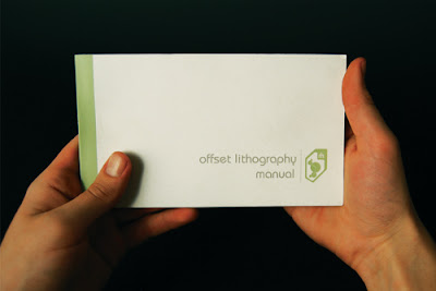
This school project was an introduction to the workings of the offset lithography process. I designed an informational booklet for Momentum Press, a print company, to hand out to interested patrons in order to explain how the printing process happens. As a centerfold I included an innovative flip-out system with additional information about the printing press illustration.

IQ Packaging


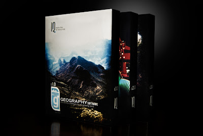
As apart of a school project I created a series of software packages for the company IQ: Brainy Toys for Brainy Kids. My target audience was boys anywhere from 10-14, and age group that often has conflicting interests especially with educational software. My aim was to design the packages with an older audience in mind because I believe kids want to be into what older kids are into. The three packages deal with geography, robotics and space travel. What kid doesn't like those things?

The Woods


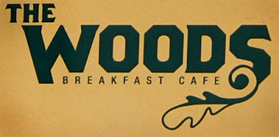
The Woods Breakfast Cafe only serves the best breakfast foods, which happens to be my favorite type of food and the reason I chose to develop this concept. I opted for a simple color palette and layout given the relaxing tone that accompanies breakfast time. This was one of my most delicious school projects.